Wednesday, 23 July 2014

Barnett Newman at the Stedelijk


Barnett Newman at the Stedelijk, Amsterdam.
 
Newman is considered an Abstract Expressionist, though his monochrome fields of colour might at
first appear to be examples of Minimalism. He considered himself an intuitive artist: 'I start each painting as if I have never painted before', he said. He recommended that viewers stand close to his works to experience physical and emotional sensations so as to elicit a sense of self within the universe. Using masking tape to paint narrow, vertical bands within the fields of colour, Newman divided the canvases, thereby providing a means of visual focus. He referred to these lines as 'zips', describing them 'as bands of light' that bring 'the entire thing to life'.
 
Like that of other American Colour Field painters, his art was created in reaction to the atrocities of WWII. With the void and light as his visual references, Newman explored the relationships of people and the absolute.


Who's afraid of Red, Yellow and Blue III, 1967-68
 
Newman began the series Who's Afraid of Red, Yellow and Blue I-IV without a preconceived plan - it was a voyage of discovery. He had planned the first work to be larger than any he had done before
and to be completely asymmetrical. He painted the canvas red which led him to add yellow and blue, 'the only colours that would work'. In so doing, he confronted the historical use of primary colours, and he particularly looked to Piet Mondrian, his forerunner in abstraction. Newman thought that Mondrian had wrongly attempted to bring these colours into balance, but, in contrast, he had no ambition to achieve balance. Instead, he wanted to invite the viewer to experience the explosive force of the colour red. In fact, Newman wanted to use imbalance as a way of freeing the trinity of primary colours from its art-historical burden.
 
In this painting the dominance of red is emphasized by a horizontal format. He used resilient loom-wide cotton, a material intended for the production of military tents. He integrated the fabric's rough texture into the work, allowing it to remain more or less visible beneath his painted layers. He painted the red in four separate layers to create an opaque colour, of which the top layer was characterized by vertical brushstrokes. The narrow strip of yellow is thicker and the blue is more transparent so that both colours contrast more emphatically with the red.


a closer look


Cathedra, 1951 (oil and acrylic on cotton)

Newman achieved the intensity of Cathedra by applying six separate layers of paint, each consisting of different blue pigments. The result is a richly nuanced pictorial surface - a carefully blended field of colour that conjures spatial illusion. Cathedra, or Throne, refers to the blue of the heavens and the throne of god, described in the Old Testament. With his title, the highly spiritual Newman wished to convey the connection he felt with the higher, mysterious forces of life while in the process of creating Cathedra. In 1997 the work was badly damaged by a visitor to the Stedelijk Museum. The  prime objective of the restoration process was to match Newman's original colour layering method as closely as possible.


Right Here, 1954


The Gate, 1954
 
The contrast between the bands of light turquoise, dark brown and black suggests that the viewer of this work is about to step through an open doorway and into an endless space. The title Newman gave
this painting ('to help the public out', as he said) invites a religious interpretation. The 'gate' of the title refers to the tabernacle in the Book of Exodus in the Old Testament.


Monday, 21 July 2014

Modern art the Rijksmuseum


Modern art collection at the Rijksmuseum Amsterdam.

A very small collection as there was no modern art at the Rijksmuseum, and they had to start from scratch.


 Baas, Marten, Grandfather Clock, 2002
 
This sculpture stands at one of the entrances of the museum


An LCD screen is installed as the face of the clock: it shows a 12-hour movie in loop of a blurred figure of a man continuously indicating the time by drawing the hour and minute clock hands with a marker directly on the screen. The combination of the human-size of the clock together with the image of the moving blurred man creates an optical illusion of a real man standing inside the clock - a figurative personal specialist telling the time. The inscribed script in this design is to trick the viewers into absorbing that false impression. And they do.


Le Corbusier, Model of the Philips Pavilion, 1957
 
At the invitation of Philips, the Dutch electronics firm, Le Corbusier designed a pavilion for Expo 58, the world's fair held in Brussels. The concrete building was coated with aluminium paint. Inside there was a multimedia show with film, coloured light and electronic music by Yannis Xenakis. Planes of colour in the entrance set the tone for the 'electronic performance' inside, which attracted one and a half million visitors.


Ferdi, Wombtom, 1968
 
Ferdi wanted to create a playful and liberating 'environment'. The sexual symbolism of her furniture sculptures literally becomes palpable when one touches the soft synthetic fur. The Womtomb lent itself to 'happenings', 'performances' and interaction. The vulva-like opening forms an entrance to the sheltered interior. It is simultaneous a cosy tomb and a womb.


Marlene Dumas, The Last Supper, 1953

During the Last Supper, Christ shared bread and wine, symbols of his body and blood, with his disciples. This was how he announced not only his crucifixion, but also that he would live on in his disciples. Dumas took the liberty of making of him a solitary, empty figure, above whose head new life appears in a 'cloud' of foetuses.


Yves Saint Laurent, Mondrian Dress, 1965
 
The abstract geometric visual language of De Stijl in the 1920s inspired a new generation of artists forty years later. The French couturier Yves Saint Laurent won international success with dresses inspired by the paintings of Piet Mondrian. This is the most elementary model of the six variants presented by Yves Sait Laurent in 1965.
 
 
Source: 


Saturday, 19 July 2014

A disappointment and a delight


I thought I would have a break from posting on Amsterdam, (which we visited at the end of June), and on Greece (which is where we are at present) and write about a day we spent in London in July.

The purpose of the visit was to go to The Serpentine Gallery to see Marina Abramovic. When we got there however, we found out to our great disappointment that the gallery was closed on that day. We wandered around Kensington Gardens instead, and had lunch at The Magazine, Zaha Hadid's new extension of the Serpentine, and that was the delight.


It was a gorgeous, sunny day, so wandering around the park was lovely.


We particularly enjoyed the Italian Garden


and its fountains


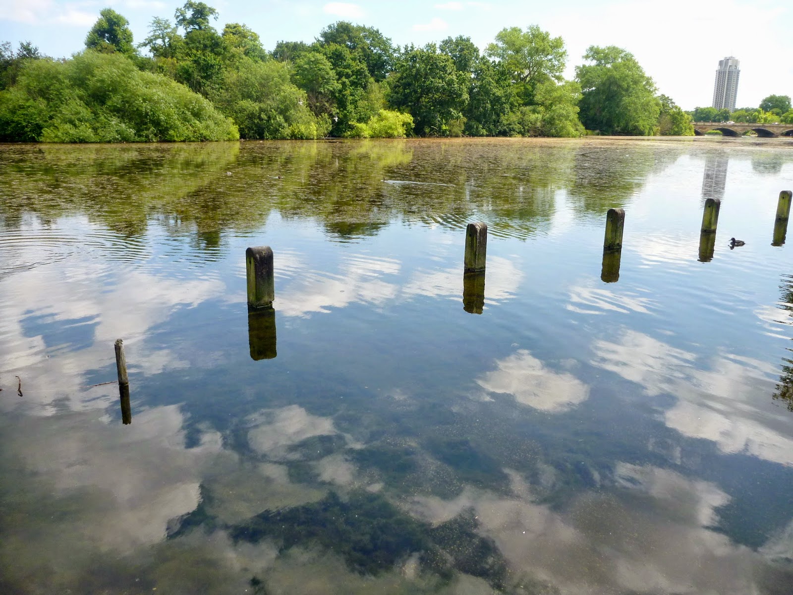
but also the reflections in the Round Pond.


This white arch looked familiar, we had seen one like it at Compton Verney so we assumed that it's by Henry Moore.


First stop, the Serpentine, but it was closed for two days, lots of scaffolding, so no point in taking a photograph


Next, we crossed the bridge, and arrived at the Serpentine Sackler gallery, the 1805 brick gunpowder storage building on the right, and the new linked pavilion designed by Zaha Hadid on the left.


The elegant roof is made from PTFE-coated glass-fibre woven fabric, its super-smooth moulded look a complete contrast to the brickwork of the 19th century building


It's a wondrous place - there is a lightness to the whole building as if it's about to float away


the brick of the old building is in contrast to the smoothness of the new, but they complement each other beautifully


as do the sculpted columns with their smooth moulded surface


but the wonder is seeing the columns as you walk in - it's like liquid light pouring down from the ceiling on to the floor


it is truly awesome


Some of the critics have been really scathing about the extension, and I really cannot understand it.


Being in there was a real experience: it's light (some critics said they found it dark!), airy, architecturally interesting,


but even if it was none of the above, just that light pouring in, is enough - it's stunning


flowing, organic forms


looking out


flowers on the tables in Alvar Aalto vases.


Finally, the washrooms are cutting edge as well - hot air came out of the Dyson taps after we had washed our hands.


Friday, 18 July 2014

CoBrA

CoBrA was an avant-garde movement active from 1948 to 1951, its name coined from the initials of the members' home cities: Copenhagen, Brussels and Amsterdam. It was formed by Karel Appel, Constant, Corneille and Asger Jorn. Drawing inspiration from primitive art forms and from the work of Paul Klee and Joan Miro, they had an antipathy towards Surrealism and shared an interest in Marxism and modernism. Freedom of colour and form, as well as spontaneity and experiment were their main preoccupations. The primary focus of the group consisted of semi-abstract paintings with brilliant colour, violent brushwork and distorted human figures, sharing similarities with American action painting - they were a milestone in the development of European abstract expressionism.


At the Stedelijk Museum:


Karel Appel, Man and Animals, 1949, (paint on canvas)
 
Cheerful and outlandish human and animal figures, consisting of vast areas of vivid colour accented by bold contour lines - the work gives the impression of being spontaneous. 


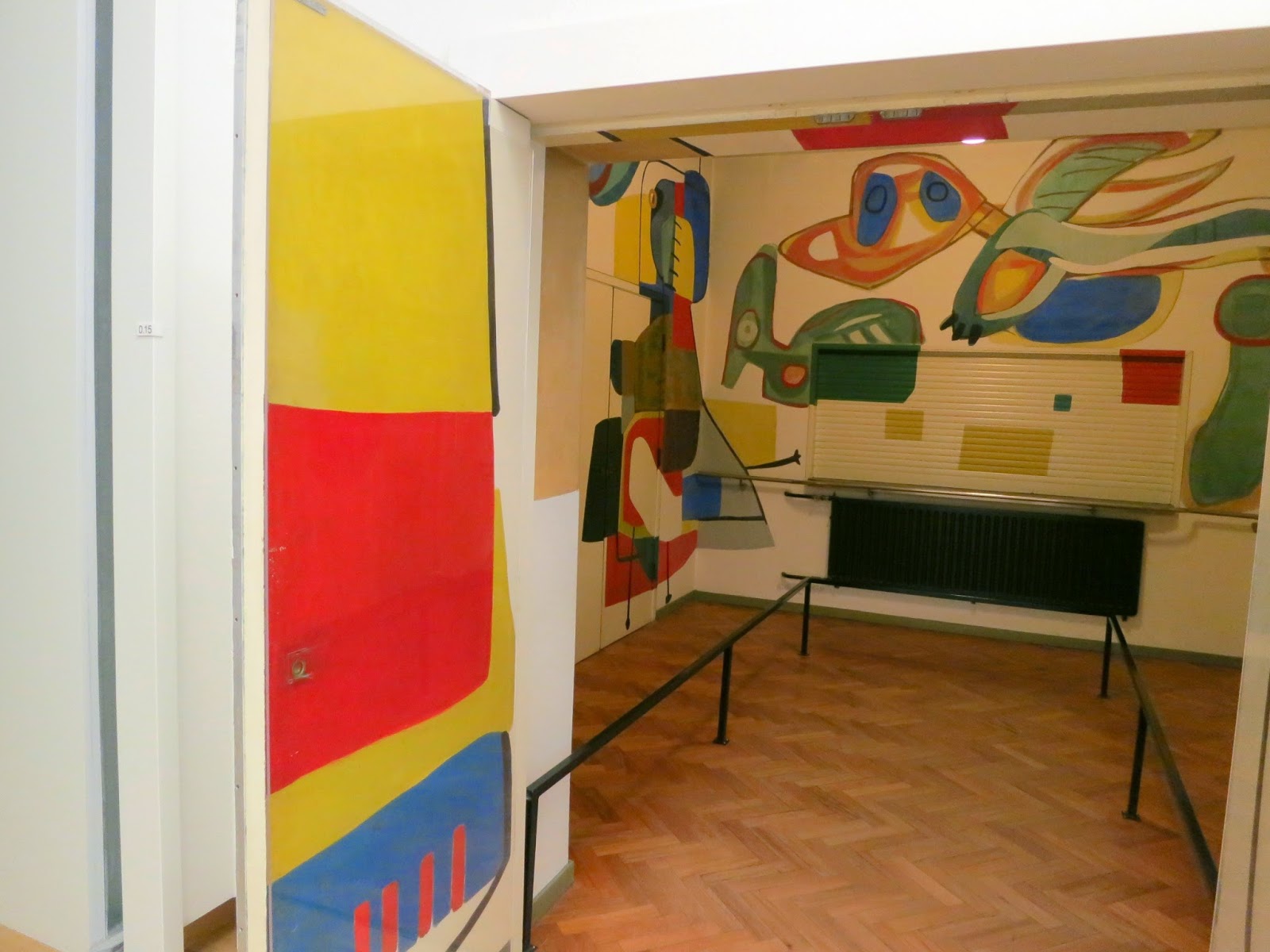
A small space painted by Karel Appel in the museum 


a different view


the signature bright colours of the group


one more view


Karel Appel, Questioning Children, 1949, (wood, paint)

In the aftermath of WWII, while traveling through Germany on his way to Copenhagen to visit fellow artists, Kael Appel was deeply moved by the faces of the children he saw begging for food on railway platforms. As a result he produced a series of paintings on the theme of 'questioning children'.


Anton Rooskens, Composition in Black, 1955 (oil on canvas)


Constant, Barricade, 1949 (paint on canvas)
 
With the naively rendered half-moon and peculiar creatures, this painting resembles the work of a child. The flat, two-dimensional nature of the scene is typical of the CoBrA style, yet the fists, grimaces and the title of the work suggest markedly political overtones. The militant suggestion of Barricade hints at Constant's Marxist-inspired views of art. The artist believed that art should be a plea for freedom and human emancipation. He felt that CoBrA should do more than simply breach artistic conventions; the movement should also play an active role in shaping a new society.


Asger Jorn, In the Wingbeat of the Swans, 1963, (oil on canvas)

Jorn shifts between figuration and abstraction in this painting. Two figures can be discerned beneath red-tinged skies on a typically hilly Scandinavian Landscape. The bright


At the Rijksmuseum:


Karel Appel, The Meeting, 1952, (oil on canvas)
 
Taking shape in the jumble of coloured lines are the figures characteristic of Karel Appel's work: children with large eyes and imaginary creatures with beaked snouts. In this painting they 'meet' one another: nothing else is actually going on. The picture is about an artist's delight in painting and the freedom to conjure up wondrous new worlds with paint alone.


Karel Appel, The Square Man, 1951, (oil on canvas) 
 
This male figure with a fierce gaze just barely fits into the almost square picture plane. Its head is about as large as its body. The composition is built up of flat planes and lines, which are intersected by a spine cutting through the body. Its arms spread wide apart and genitals boldly exposed, this colourful character forces itself on everyone. 


In 1950 Appel visited Psychopathological Art, an exhibition of works of art made by patients undergoing therapy, which was on view in the psychiatric hospital of Paris. The accompanying brochure was not illustrated, so Appel decided to add illustrations himself. He drew and painted over the text of the brochure, deriving inspiration from the psychiatric patient's uninhibited powers of imagination.
 
*   *   *
 
 
For the artists of the CoBrA group the art of psychiatric patients was an important source of inspiration. In their work, these artists tried to achieve the same creative freedom and uninhibited expressiveness. The drawings below originated from the time Appel visited the Psychopathological Art exhibition. 


*   *   *
 
 
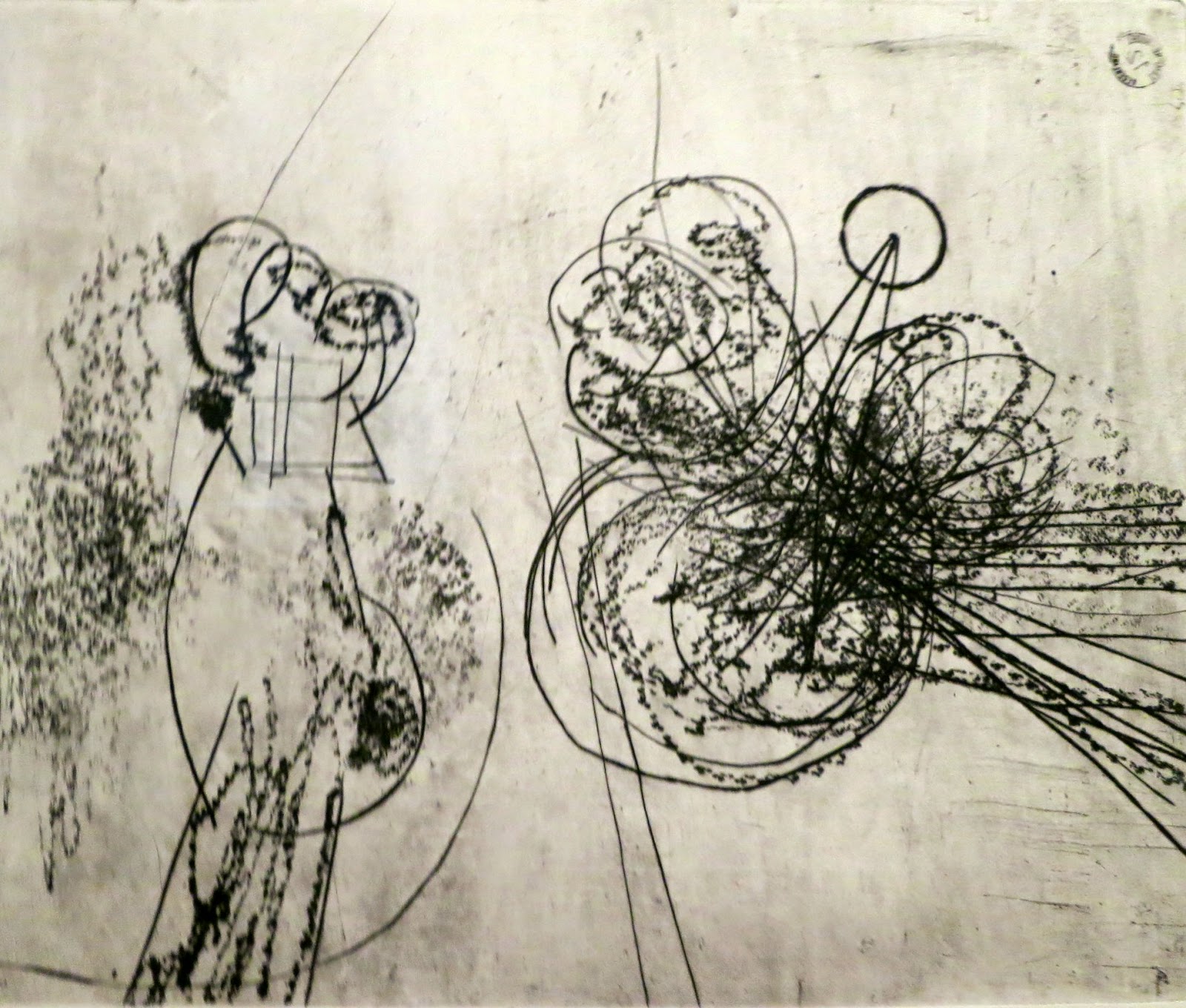
The series of prints below with a few so-called 'holes etchings' is the most experimental graphic art Constant ever made. The scratched in marks and reserved holes raise associations with charts of solar systems, or maps of imaginary countries. The prints date from the period when Constant was working out his futuristic project New Babylon in graphic art, maquettes, manifestos and writings.