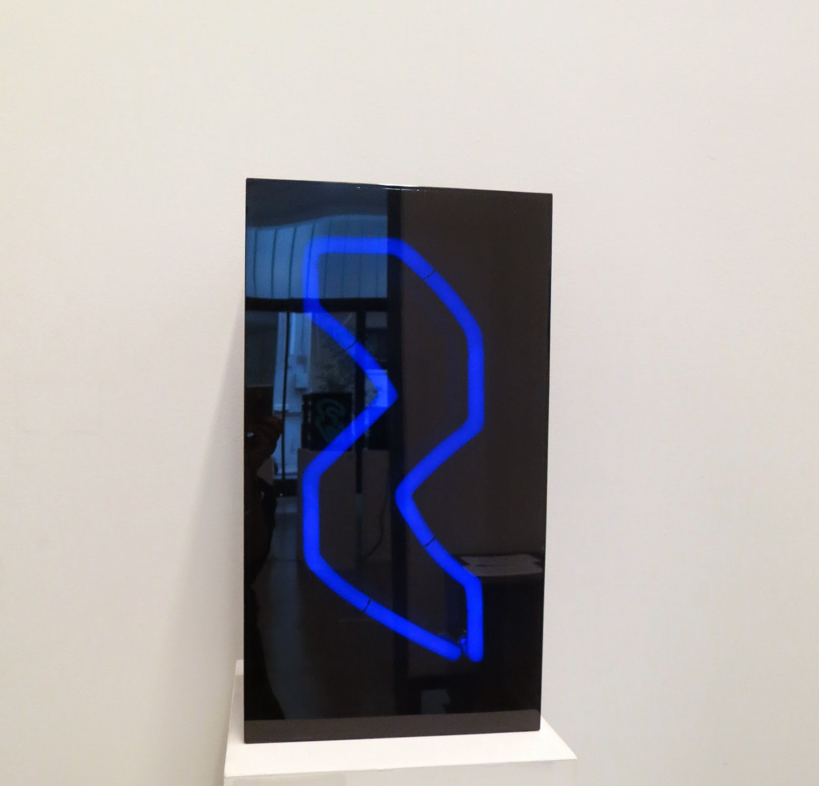
Chrysa Vardea at the Kalfayan Galleeries, Haritos, Athens.
Chryssa (she used only her first name professionally) a Greek-American artist, was born in Athens in 1933, studied art in Paris and moved to New York in 1955. Her first body of work was concerned with typography and newspapers. She grew up amid the Nazi occupation of Greece, a time when members of the Greek underground communicated with one another by writing furtive messages on the walls of buildings. It has been suggested that this was the wellspring of her obsession with fragmentary text. In 1961 her work was featured in a solo exhibition at the Guggenheim.
'Between 1958 and 1962 Chryssa Vardea began her exploration of typography. She explored how far she could go in recreating the page of a newspaper, studying its structure, the arrangement of the columns, the use of language, the typographical elements and the image as a unified structure which she did not reproduce with accuracy, but creatively. Preliminary drawings soon gave way to prints, aluminium sculpture and paintings on the theme of the newspaper page, which were considered as a precursor of Pop Art.
For Vardea the newspaper as a source of information and the recording of events, did not just have aesthetic value nor was she interested in the socio-political context of the news. She predominantly focused on the semiological aspect of the alphabet and writing, on the geometrical space that is constructed through the structure of the lines, the repetition, the lack of continuity, and the diversity of visual information. Her preoccupation with the codes of visual communication of newspapers and advertisements is connected with the rise during the 1950s of the culture of the spectacle, technology, information and consumerism, a fact that is also revealed in her later sculptural works which are made primarily with contemporary industrial materials such as neon, aluminium and plexiglass.
Japanese calligraphy and Byzantine icons were also basic sources of inspiration that nurtured her consistent choices in the representation of light and the written word'. (Syrago Tsiara, art historian).
Some critics expressed discomfort that Chryssa's artwork, with its layers of atomized text, could not easily be interpreted. But that, she replied, was precisely the point. 'I have always felt that when things are spelled out they mean less, and when fragmented they mean more'.
Times Square made a very strong impression on her and the square became a source of inspiration and a theme to which she returned regularly. 'I saw Times Square with its light and letters and I realised it was as beautiful and difficult to do as Japanese calligraphy'. The illuminated neon billboards were as revelatory as the brilliant gold background of Byzantine icons. At the beginning of the 60s neon made its first appearance in her sculpture (previously the exclusive province of sign makers) as she realised that it could provide the marriage of text, colour and illumination she needed in order to express herself.
'Light and shadow. Happiness and creative restlessness. The ticket. The differentiality of nouveau realism during the 60s, the years of abstract expressionism. The first step. Vision. Inspiration. A stroll through Times Square. Neon advertisements that transform the city. Two different aspects in an artistic harmony. Classic during the day, white steel, with small white lights that created a word and changed at night, offered something from the Byzantine Empire to the sky of the city', wrote Vardea.
Her art which prefigured Minimalism and Pop Art, was exhibited widely in the United States in the 1960s and 1970s and is still in the collections of museums such as the Whitney, the MoMA and the Guggenheim.
The Gates to Times Square, 1966 (stainless steel, plexiglass and neon tubing)
is considered to be one of her best known works. It is in the form of an immense cube through which visitors can walk. Inside, after passing through the entrance which is in the form of a large capital A, visitors are met with a counterpoint of text, symbols and colours.
The Gates to Times Square is not featured in this exhibition, but I wanted to include it, to give a more comprehensive view of her work. You can see more about it here.
Sources:
Exhibition text from Kalfayan Gallery.
New York Times obituary.


What an education I'm getting through your posts! I had not heard of Chryssa before, and must try to find time at some point this summer to look up more about her, especially as I have a general interest in typography - and in neon.
ReplyDeleteThanks, Olga. I had not heard of Chryssa before either, but I liked what I saw in the gallery and liked the stuff I found on google even more. Another female artist who has not had the recognition she deserves. I read in the obituary that even though she was quite 'big' in the States in the 60s and 70s, her death in December was not reported outside Greece. Or maybe not widely reported, given that there was an obituary in the Times.
Delete