
Dictionary of Silences, Colin Hitchmough, at Leamington Art Gallery.
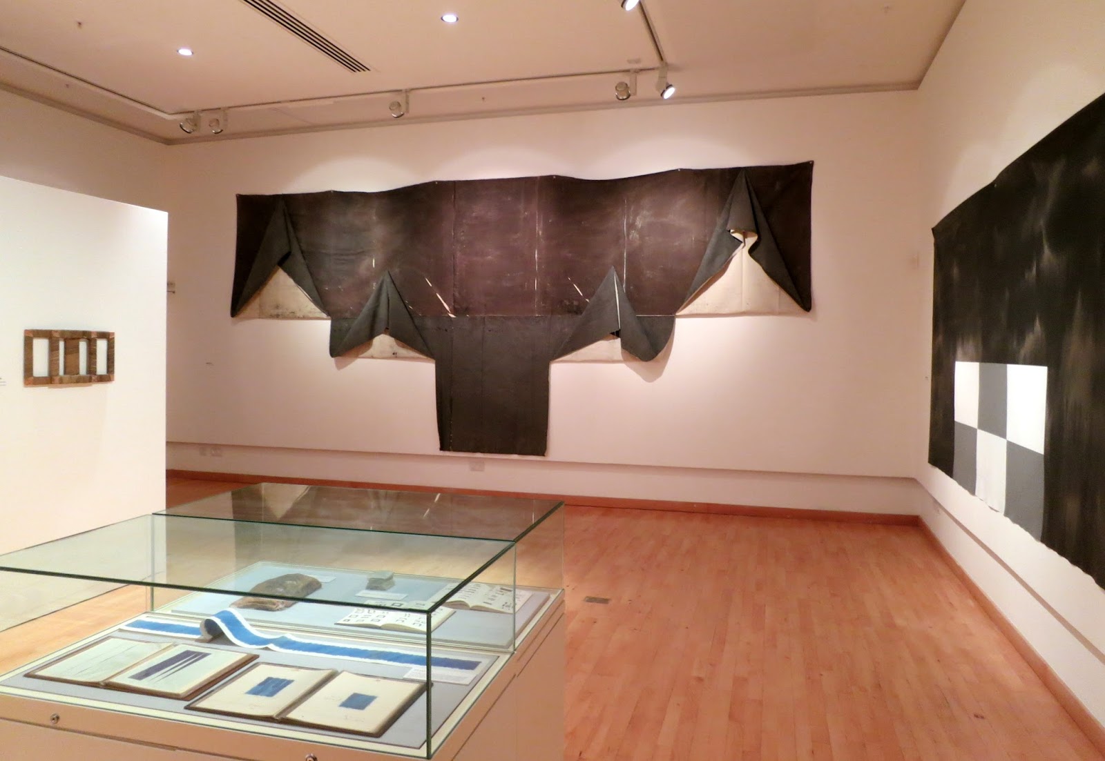
Hitchmough's main concern is the notion of painting. As a student in Liverpool and then Birmingham, he was preoccupied with where he 'stood on figure-field painting issues, between what is an incident on a surface and what just is, the painting as object'. In his attempt to tackle the idea of 'painting' head on, he has detached the canvas from its wooden stretches, suspending it loose from hooks; he has stained, folded and cut canvasses so both sides of the painting can be revealed at the same time. Broadly, he has turned the idea of what a painting is physically made of, inside out.

Pier, 2006 (acrylic on canvas)


Untitled, 1971, (acrylic on canvas)

looking closer

NY House, 2001 (acrylic on canvas)
In the mid-1980s Hitchnough began using blocks of paint in an effort to achieve a very direct 'no-(art) nonsense' approach. By 2000 he was beginning to think of these blocks as 'containers for ideas, thoughts, memories, friends and conversations'. In several of the works they became 'houses'.

New York House, 2001 (acrylic on canvas)

Colour Theory, 1971, (acrylic on canvas)

Corrected Painting, 2004, (acrylic on canvas)

Landscape, 2007, and Portrait, 2007, (acrylic on canvas)

Terrapins, 1975 (mixed media)
These works were created in huts owned by a company called Terrapins. Pieces of wood are bound in canvas and dipped in acrylic, transformed into objects with organic qualities.

looking closer

History of the North-West, 1975 (acrylic on canvas)

Dictionary of Silences, 2015 (acrylic on canvas)
The Dictionary of Silences works were inspired by a visit to the library in Millies, a village on the slopes of Mount Pelion in Greece. While being shown around the library by a guide, Hitchmough thought he heard that the library contained a book called The Dictionary of Silences. Fascinated, he attempted to find out more, only to discover that the book did not exist and he had clearly misheard the guide's words. However, the idea of the fictional dictionary continued to intrigue him and he began to produce works which explored the concept. This exploration and examination of a fictional dictionary and the idea of depicting something as familiar yet undefinable as silence, takes Hitchmough into an area of unreality, but also one of universality and timelessness.
For these paintings Hitchmough used the wet on wet technique to achieve a particularly painterly effect and each painting represents a page in an imagined book in the library.

Dictionary of Silences (Aurora Bognorealis), 2015, (acrylic on canvas)

Dictionary of Silences, 2015, (acrylic on canvas)

Small Silences, 2014, (marker pen and acrylic on canvas)

The People's Flag, 1982, (acrylic on canvas)
This work was exhibited after a period when Hitchmough had decided not to show his work but to focus on moving forward in his exploration of the concept of painting. At this stage he concluded that it was important to 'allow the brush mark back in again'.
White painted lines cover rapidly drawn chalk markings on a black stained ground. The title makes one think of banners and flags, particularly those associated with the Socialist movement from the time of William Morris and onwards.
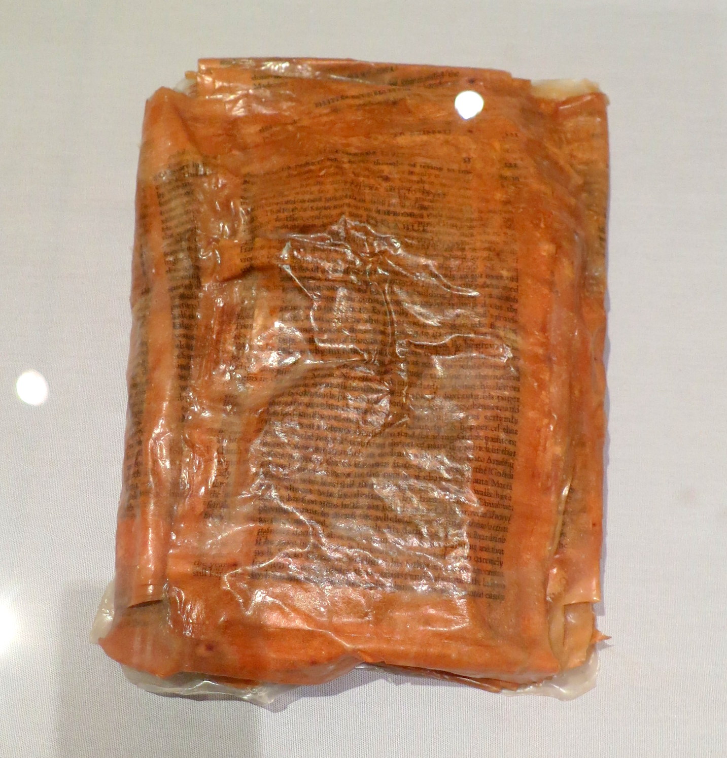
The Lives of the Artists, 1977, (mixed media)
This stack is made from the text from Giorgio Vasari's famous book, The Lives of the Artists, first published in 1550. The pages have been dipped in acrylic and stuck together. Vasari's words are preserved and venerated, but now unreadable: an ancient text brought into the present day and bound by the physical materials of the art it celebrates. The additional pages of essays and title pages from the book were used by the artist to create a similar stack which is not exhibited in Leamington Art Gallery.

Breathing English Air, 1976-83, (acrylic)
This work was made using acrylic which was dried into sheets then cut and stacked. The title is a quotation from Rupert Brooke's poem The Soldier.


