Wednesday, 18 February 2015

Lynda Benglis


Lynda Benglis


at the Hepworth, Wakefield.

Benglis is most well known for a piece of work she did 40 years ago when she posed naked and oiled, wearing just a pair of sunglasses and yielding a double-headed, oversized dildo, intending it for publication in Artforum magazine. When the magazine declined to publish the image, Benglis paid for advertising space. Outrage followed when the advert appeared and five editors resigned. In response to episode, Benglis made five bronze casts of the dildo which she titled Smile.

An explicit parody of gendered relationships, of the tradition of the 'pin-up' girl images in magazines, and a confrontation of the overt male bias in the art establishment, this was an iconic work, and a good example of the 'culture wars' that raged in America during the 70s and 80s.

The photographer Cindy Sherman has described her college-age encounter with the Artforum ad in all its audacity, as 'one of the most pivotal moments of my career'

This was not typical of her work before or since, however. Working across a range of materials, ranging from beeswax, rubber, polyurethane, bronze, cloth, paper and ceramics, Benglis creates abstract sculptures which explore the physicality of form and how it affects the viewer. Her approach to art making is process-oriented, challenging the traditions of sculpture and painting, with a unique approach to form exploring the physical dialogue between work and viewer.

Benglis emerged as part of a generation of artists forging new approaches to art in the wake of Abstract Expressioism, Minimalism and Pop Art. Her work has challenged the status quo and she has produced some of the most iconic works of art from the 20th century. Yet, like every woman throughout history she has been marginalised and her place in contemporary art history has been neglected. Her influence can be seen in the work of many younger artists working today: the plastic 'blobs' of Roxy Paine; the sexually suggestive props of Matthew Barney; the floor pieces of Polly Apfelbaum; the ambiguous shapes created by Franz West; the work of Cindy Sherman.

 
Fallen Paintings:


These poured latex sculptures one-upped Jackson Pollock's action paintings in the late 1960s. She poured pools of swirling pigmented latex directly on the floor, obscuring the distinction between painting and sculpture, bringing painting into architectural space. The importance of process in her work is emphasised here - material, colour and image in one single form in this choreographed process.


Baby Contraband, 1969  (poured pigmented latex)


Rumpled Painting/Caterpillar, 1968


one more view


Polyurathane: 


Wing, 1970  (aluminium)

Challenging the rigidity of Minimalism during the 1970s Benglis made several  site-specific installations in which she choreographed multiple polyurethane pours that projected out of the wall in dramatic arrangements. Wing is the only metal cast made from this work nearly all of which was destroyed when the installations were dismantled. Wing epitomises the idea of the 'frozen gesture', a term Benglis often used to describe her early sculptures. Flows of polyurethane have been seemingly caught in motion, which is emphasised by the work's polished aluminium surface.


Quartered Meteor, 1969/75 (lead)

Like many of her 'pours' from the 60s and 70s this work was cast from an original polyurethane sculpture called King of Flot (1969) which was formed in the corner of a gallery space. Casting in metal allowed Benglis to preserve the forms and play with the viewer's perception of their materiality. Though solid, Quartered Meteor's oozing surface, which resembles flowing lava, suggests a permanent liquid state. Its corner placement draws attention to the architecture of the space in which it's installed.


Come, 1969-74 (cast bronze)


The Graces, 2003-05 (cast polyurethane, lead, stainless steel)

The Graces is made from polyurethane which Benglis squirts out of a pressurised can - a gesture that alludes to the act of painting. The material has the ability to both absorb and give off light and as Genglis has observed: 'I'm after that translucent quality we see in sunsets and sunrises and the moon when it's full. All my ideas come directly from nature'.


Greek influence:


Greece has been an enduring source of inspiration for Benglis. Her father was the son of Greek immigrants from Kastellorizo. As well as drawing from Greece's art and architecture, Benglis finds equal aesthetic inspiration from its culture and traditions listing the 'Caryatids on the Acropolis, the holiday cookies, the braided Easter bread, the gold and gilded elements from the Orthodox religion' as important influences.


Greek motifs appear in different forms in Benglis' work. While her 'sparkle knots' can be read in relation to bodily forms and gestures, Benglis has also likened them to floral wreaths hung on the doors of Greek houses during May Day celebrations. Her gilt 'torso' wall-based sculptures, which are often titled with Greek names such as Minos and Perseus, marry the curves of the human body with references to Greek mythology and Hellenic sculpture, motifs which are also explored in her series of 'pleats' which twist and unfurl into dramatic baroque shapes. Beglis' use of gold in these works suggests both weight and weightlessness, drawing attention to surface while using its reflective qualities to 'conceive form with variations in light'. Her use of precious metal also provokes questions about value, taste and the difference between economic and aesthetic worth.


Proto Knot, 1971 (wire mesh, cotton bunting, plaster gesso and sparkles)


Sparkle Knot IV, 1972 (aluminium screen, bunting, plaster, paint and sparkles)


Bravo, 1972 (stainless steel, copper and Babbitt metal)


Tres, 1976 (wire mesh, cotton bunting, plaster, sprayed aluminium and copper)


Gamma, 1972 (aluminium screen, cotton bunting, acrylic paint, gold enamel and sparkles on plaster)


Siata, 1987-88 (copper over stainless steel)

Her first pleated works were inspired by an exhibition of Aegean art Benglis visited in Paris in 1979.
Moving away from the 'knots' she had been making up until this point, she began to work on this more open, pleated form made from wire screen which she covered in gold leaf and later in sprayed liquid metals. She has cited the gilded icons of the Greek Orthodox tradition as inspiration for these works, alongside references to drapery, flora and fauna and decorative jewellery. The 'pleats' are closely concerned with exploring the forces of movement within sculptural form.


Scarab, 1990, (stainless steel mesh and aluminium)


looking closer


Black Orchid/Stutz Bearcat, 1985, (bronze, mesh wire, zinc, copper and chrome)


Lagniappe I (Orange/Blue), 1978


looking closer 


Beatrice, 1979 (chicken wire, plaster, gesso, oil-based sizing and gold leaf)


Minos, 1978 (chicken wire, cotton bunting, plaster, gesso, oil-based sizing and gold leaf)


Primary Structures (Paula's Props), 1975 (lead, aluminium and plaster, plastic plant, live plant and velvet)
 
The title of the work alludes to a landmark show entitled Primary Structures: younger Amerian and British Sculptors which was a survey of minimalist art featuring almost-exclusively male artists. Benglis' 'mock' installation can be read as a critical response to the machismo of the exhibition. It also functions as a commentary on the nature of sculpture itself, as she was interested in 'the idea of the structure, of object and pedestal'. In its theatrical pairing of classical Greek forms with objects that might be considered kitsch, the work caricatures the appropriation of Greek art as a symbol of aesthetic aspiration.
 
 
India: 
 
 
Since 1979 Genglis has travelled annually to India and often works with paper when she's there.


Untitled, 1970 (encaustic pigmented beeswax and Damar resin on Masonite)


looking closer


Hoofers I and II, 1971-72 (aluminium screen, red cotton bunting, plaster, gesso, acrylic and glitter)


Described as 'Totems',  Hoofers draw on a wide range of references, from African art to Barnett Newman's painted 'zips'. Their gaudy surfaces appear to have more affinity with craft and costume than with sculpture and they demonstrate Benglis' ongoing interest in challenging notions of value and taste.


Prey Being, 2000, (coiled aluminium and brass wire, sculpted pigmented abaca paper, pigment and gold leaf flecks)  and
Earth Cavern, 2001


looking closer


Zanzidae: Peacock Series, 1979 (wire mesh, enamel, glass and plastic)


Manu Light Vessel I and III, 2009 (wire, electric bulbs, bamboo and recycled handmade cotton Gandhi Ashram paper)
 
 
New Mexico:

Benglis travelled to New Mexico in 1993 and has since constructed a studio and dwelling there.


Although she had studied ceramics as a student in the 1960s she only returned to using clay at this time. She uses the coiling method.  


Figure 2 and 5, 2009 (bronze, black patina)


Sexual Mockeries:

Between 1972 and 1976 Benglis produced fifteen videos which were made alongside her 'sexual mockeries' series of advertisements and invitation cards in which she performed a series of character tropes, engaging with ideas relating to gender roles and sexual identity.


An Amazing Bow-Wow, 1976, video  (image taken from here )

This body of work anticipates Cindy Sherman's work by a number of years.


Female Sensibility, (1973), video
 

Female Sensibility is one of Benglis' most iconic videos. It depicts Benglis with fellow artist Marilyn Lenkowsky as they touch, lick and kiss each other in a tightly-focused frame. This erotically-charged scene is accompanied by a soundtrack of collaged radio broadcasts, many of which include men making patronising or dismissive references to women.

Female Sensibility creates a space in which the male presence is made redundant and marginalised sexualities are given airtime. The tightly cropped frame of video occasionally renders the subjects as abstract shapes and the continued gesture of touching casts the bodies of the protagonists as sculptural forms.


Sources:
 
Information provided by the gallery and extensive reading and research.


Tuesday, 17 February 2015

Paul Cezanne

 
Another outcome of our 'Impressionist' day in London.
 
 
In his later years Cezanne attempted to solve some problems that he encountered in his painting, and consequently revolutionised painting. He admired the work of the Impressionists who had given up mixing the pigments on the palette and had applied them separately on to the canvas in small dabs and dashes, to render the flickering reflections of an open-air scene, but found it too messy. He longed for strong, intense colours as much as he longed for lucid patterns.  He found however that painting whole areas in pure primary colours endangered the illusion of reality. Pictures painted in this manner resemble flat patterns and fail to give the impression of depth. In his attempt to achieve a sense of depth without sacrificing the brightness of colours, to achieve an orderly arrangement without sacrificing the sense of depth, he sacrificed the conventional correctness of outline. His indifference to 'correct drawing' revolutionised art and earned him the title of the 'father' of modern art.
 
Cezanne once remarked that one must detect in nature the sphere, the cone and the cylinder - this was adopted literally by the Cubists who adopted the sphere, the cone and the cylinder in their work and who also sacrificed conventional correctness of outline. A new era in art had begun.
 
 
At the National Gallery:


Still Life with Water Jug, 1892-3
 
Cezanne's indifference to 'correct drawing' is best seen in this painting. As he wanted to study all the shapes on the table in their relationships he simply tilted it forward to make them come into view: a sense of depth has been achieved without sacrificing the brightness of colours.


Bathers (Les Grandes Baigneuses), 1894-1905
 
Eleven female figures repose in an imaginary landscape bordered by trees. The forms of the landscape mirror the women's sculptured bodies. Cezanne outlines the figures and the main features of the background in blue, heightening the serene atmosphere and suggesting the unity of human beings with nature.


Hillside in Provence, 1890-2

Complex rock formations close off the foreground and contrast with the open panoramic landscape beyond. Cezanne has applied paint in blocks of different colours so that the canvas appears divided into geometric bands of rocks, trees, hill and sky.


Avenue at Chantilly, 1888
 
This painting illustrates Cezanne's increasing interest in suggesting form and atmosphere through contrasts of colour.


The Stove in the Studio, 1865


The Avenue at the Jas de Bouffan, 1871

Alternating strips of light and dark green paint show sunlight playing on the trees late one summer afternoon. The view has been cropped at the top to give the painting an impression of depth despite its small size.


At the Courtauld:


The Lake at Annecy, 1896


Farm in Normandy, 1882


Tall Trees at the Jas de Bouffan, 1883
 
Most of this painting has been executed with small parallel brushstrokes. Cezanne favoured this technique in the 1880s. It creates a shimmering effect which is particularly well suited to this picture. The leaves of the trees seem to rustle in the breeze.


The Etang des Soeurs, Osny, 1875
 
Cezanne used a palette knife to apply the paint in broad swathes, creating a dense pattern of colours and lively surface effect. The strong diagonal sweeps of the knife across the centre of the painting, and the vivid yellow-green tones draw our attention away from the shadowed foreground to the water and foliage along the far bank.


Monday, 16 February 2015

Vilhelm Hammershoi at the National Gallery


In December 1898 Vilhelm Hammershoi moved into an old merchant house in Christiansen. He painted the interior of his house more than sixty times, sometimes portraying sparsely furnished rooms, sometimes including the figure of his wife in a long black dress. She is either viewed in profile, but most often from the back, often reading a letter or a book.

The paintings are almost stripped of colour with a distinctive grey-themed palette. There is a powerful sense of stillness and silence. Spare and almost bare, the rooms seem to be self-enclosed.

These paintings have a restrained elegance and a quiet power that draws and enchants.


Interior, 1899.


Sunday, 15 February 2015

Paul Gauguin


Paul Gauguin paintings that we saw during our 'Impressionist' day in London.

Gauguin developed his own particular style which consisted of flat patterns of colour and simple outlines, before he moved to Tahiti. Tahiti was not what he had expected. Instead of Paradise, he found a colony - a society that had been destroyed by colonialism where alcoholism and prostitution were rife. But even so, the bright colours of the island helped to give his palette an even more resonant intensity. He believed that colour could act like words; that it held an exact counterpart for every emotion, every nuance of feeling. Painting's task was not to describe but to express.


At the National Gallery:


Paul Gauguin, Harvest: Le Pouldu, 1890

Women harvest wheat in a field on the edge of a deep blue sea. This stretches away into the horizon, emphasising their isolation. The simplified, unrealistic forms and the bright contrasting colours are intended to demonstrate the primitivism of life in Le Pouldu, where life is eked out from the poor soil and the sea.

At the Courtauld:


Haystacks, 1889

Spatial recession and perspective are deliberately ignored. The haystacks and the bush to the left are simplified and rendered only as bright patches of flat colour.


Te Perioa (The Dream), 1897 

Te Perioa was painting during Gauguin's second stay in Tahiti. It shows two women watching over a sleeping child in a room decorated with elaborate wood reliefs. The figures do not communicate, heightening the sense of mystery. Gauguin meant the subject to be unclear. He wrote: 'Everything is a dream in this canvas: is it the child? Is it the mother? Is it the horseman on the path? Or even is it the dream of the painter!!'


Nevermore, 1897
 

The two women in the background and the 'bird of the devil that is keeping watch', as Gauguin called it, seem to be conspiring against the reclining woman. She lies awake, perhaps conscious of being watched. The title evokes Edgar Allan Poe's The Raven', in which a poet, driven mad by the loss of his love,  hears a raven repeating endlessly 'Nevermore'. Here, Gauguin suggests the loss of innocence referring to the destruction of Tahiti by colonialism.


Friday, 13 February 2015

Claude Monet


Claude Monet at the National Gallery, Trafalgar Square.


The Beach at Trouville, 1870


The Gare St-Lazare, 1877

What interested Monet when he was painting this picture, was not the railway station as a place where human beings meet or leave - he was fascinated by the effect of light streaming through the glass roof on to the clouds of steam and by the forms of the engines and carriages emerging from the confusion.


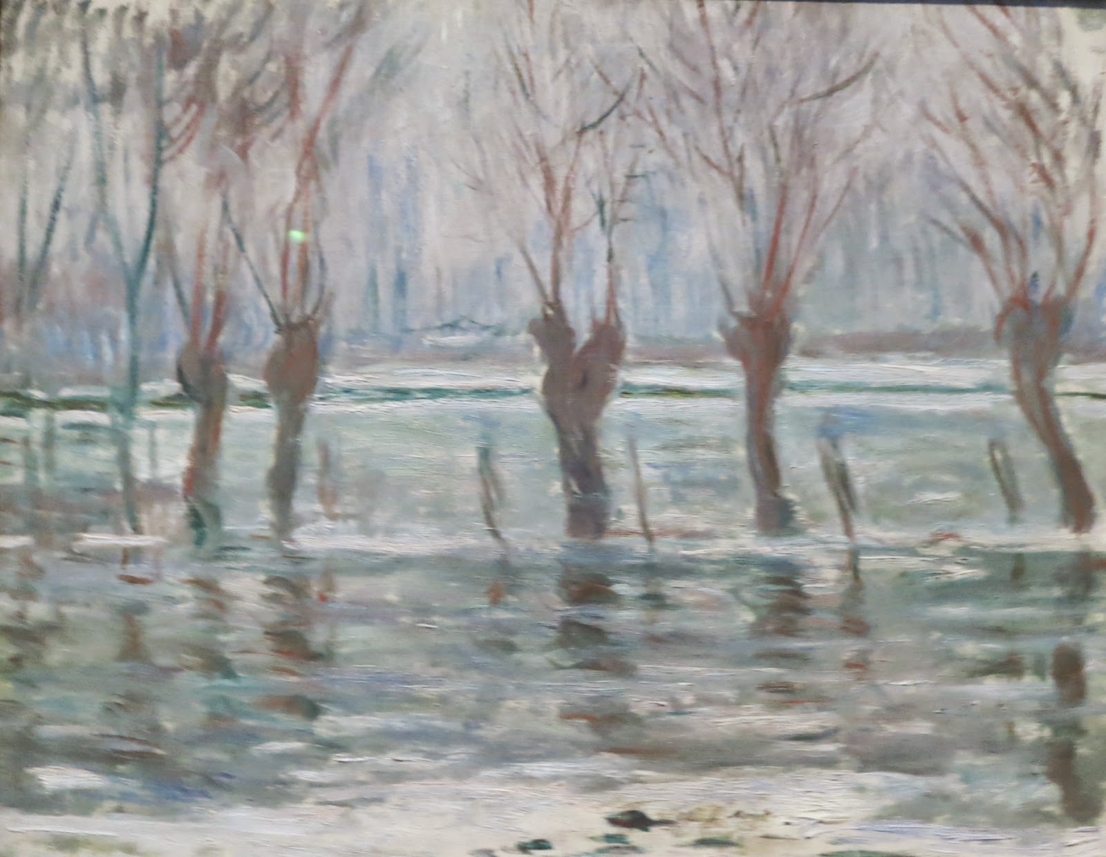
Flood Waters, 1896

The Epte, a tributary of the Seine, flooding meadows.  Ten years later Monet diverted the tributary in order to create his water garden.


Monet declared that his subject was not a view but the act of seeing that view - a process of mind, unfolding subjectively, never fixed, always becoming. In order to achieve this, his subject had to be known, available, so the garden at Giverny was constructed.

His work was already moving away from the deep field of view in his earlier Impressionist canvases, as seen in the first two paintings of this post. What followed was a flattening of view and the study of one subject at different times of day.


The Water-Lily Pond, 1899

The bridge in Monet's water garden, seen from the pond itself.


The Water Garden at Giverny

In the Waterlilies paintings the flattening of view is taken further. The paintings are a long inspection of a drowned, reflected world, in which no sky is visible except by reflection: the water fills the whole frame. There is no foreground, no background; instead a web of connections. In these near-abstract pictures, forms dissolve to the point of disintegration.


Water-Lillies, Setting Sun, 1907

The pink and yellow rays of the setting sun shimmering on the still surface of the pond, and the inverted reflection of a weeping willow over which water-lilies float.


Thursday, 12 February 2015

Georges Seurat


Georges Seurat paintings we saw during our 'Impressionist' day in London.


Georges Seurat wanted something more stable than the brush-stroke as used by the Impressionists. Having studied scientific theories of colour analysis and visual perception which showed that colour perception is a matter of interaction, a web of connected events, rather than the simple presentation of one hue after another, Seurat resolved to make this explicit by making his colour patches tiny, reducing them to dots: Pointillism was born. Placed side by side, the dots grew by the million and coalesced into form and in this way he was able to make all the shifts of colour that he needed to. The colours blended in the eye without losing any of their intensity and luminosity.


At the National Gallery:


Le Bec du Hoc, Grandcamp, 1885
 
The promontory of Le Bec du Hoc was a spectacular geological feature later destroyed by bombs during the Second World War. In 1888 Seurat reworked the surface of the painting and added the painted border, modulating its colours in relation to the painting itself.


Bathers at Asnieres, 1884

Asnieres is a suburb of Paris. On the right is the island of the Grande Jatte (the subject of Seurat's most famous painting) and in the distance, the factories of Clichy. Seurat reworked parts of the picture, such as the hat of the boy on the right, probably in 1886 after he had invented the technique of pointillism. The work is based on numerous preparatory drawings and oil sketches.


At the Courtauld:


Boat by a Riverbank, 1882


Horses in the Water, 1883


Beach at Gravelines, 1890

This was painted a year before the artist's death at the age of 31. It's almost abstract in its simplification. A boat at the centre of the composition marks the horizon. Particles of sand have been found embedded in the paint, suggesting that Seurat painted this in the open air.


Man in a Boat


Young Woman Powdering Herself, 1888-90
  
This painting is a striking demonstration of Seurat's pointillist technique. The modulation of light and shadow on the wall is achieved with the use of small dots of pure colour juxtaposed in varying concentrations and intensity.


The Bridge at Courbevoie, 1888-87.